gis-portfolio
Response to Breakthrough Houston RFP
Breakthrough Houston (BTH) is an educational program with the aim of placing motivated students from underserved backgrounds on a path to college, and they have sites throughout the Greater Houston Metropolitan area that allow them to facilitate programming in different areas in town. While some people are familiar with the program, they may not necessarily know which site is closest to them. BTH has put out an RFP to get their mapping needs met. Below are the steps I took to bid for and fulfill their needs.
The Bid
The Customized Map Style and Its Components
The Map Style Breakdown
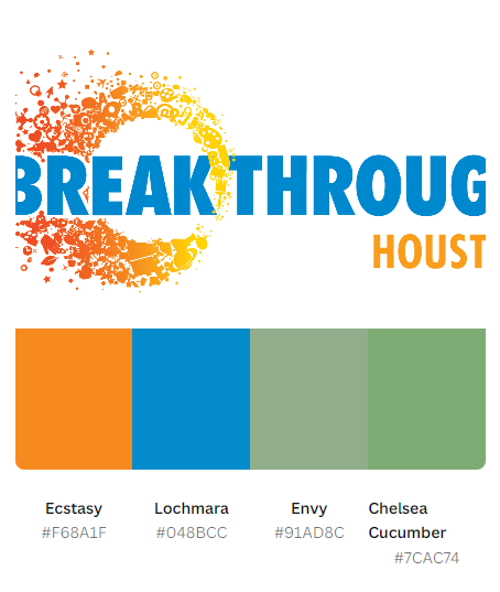
Using Breakthrough Houston’s logo, I gathered a color palette using Canva’s Color Paletter Generator. In the following image, you’ll see which hex codes were the output for BTH.
Using Google Styling Wizard, I using the hex codes gathered from their logo and build out their customizable map. The JSON Code Sample is linked here:
Breakthrough Houston Customized Map Style
The Map Style
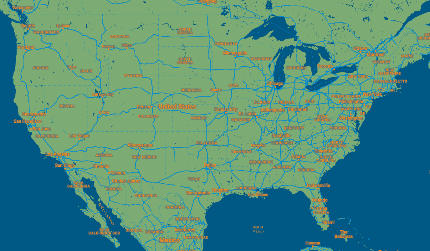
Here is a further zoomed out view of the map, which allows you to see how the color palette plays out a larger scale.
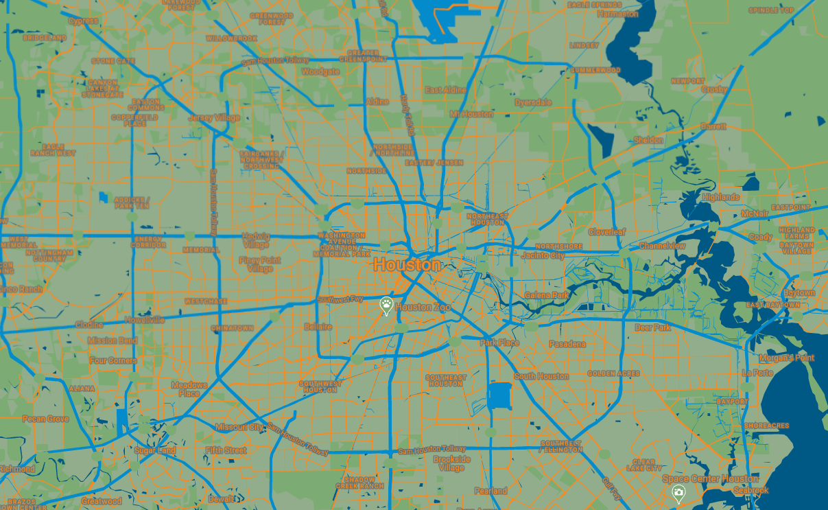 Here is a further zoomed in view of the map, which allows you to see how the color palette plays out a smaller scale.
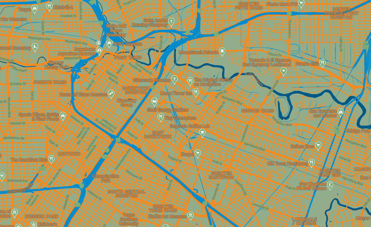 Here is a close up view of the map, which allows you to see how the color palette plays out nearly at street level.
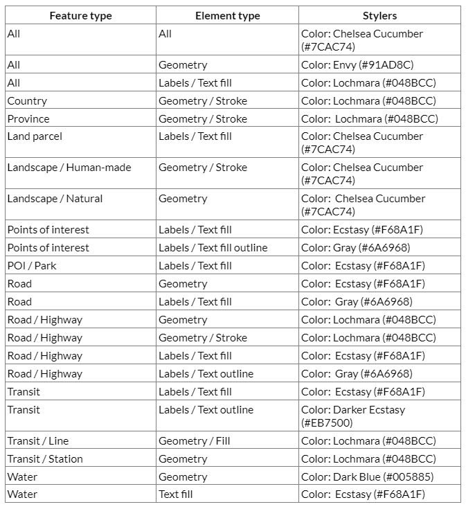
The Lookup Table
Design Choice Overview
While the blue (Lochmara) and orange (Ecstasy) contrast each other very well, the brightness of the orange could be hard on the eyes as the details became more granular through zooming in. For this reason, I decided to take the liberty of using a more muted blue and orange to hopefully eliminate strain on the eyes. Additionally, given too much detail, the colors began to clash, I began using gray to better outline certain labels to also make it easier on the eyes. Gray worked because it did not necessarily take away from the existing palette, and it matched most of the text on the company website, which uses gray instead of black.